The anatomy of a button in Sketch
They say that if you’re constantly repeating a process, there’s a good opportunity for automation. And that is truer than ever in an era that focuses on areas like rapid development, machine learning and AI. As designers though, we often quietly struggle with doing things a certain way with the only excuse that we’ve been doing things that way forever.
I’ve experienced this myself in the past, of course, and have also seen a pattern of repetition by talking to fellow designers or even in my past life as a UX Manager at various companies including HBO Latin America and Claro.
One of the areas where I saw a lot of time spent when creating a multi-platform giant like HBO Go was, believe it or not, buttons. Of course, the amazing people at Bohemian Coding came to our aid by releasing an update that made nesting symbols possible, therefore making possible the method that I am about to show you.
Creating a Button
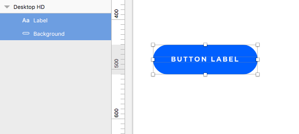
Let’s start with the basics by creating a button shape, pill shape in my case, and adding text to that button.

Let’s then rename those layers so we’re not going crazy later on with fugly layer names.
Now let’s group those, and let’s give that group a nice name that will 1)tell us that this is a button and 2)will also serve the purpose of organizing our symbol. In my case I am using asset/button as my group name. Then we’ll select that group and create a Symbol out of it.

The naming convention allowed me to have a nested list, which becomes really handy when you have tons of elements to work with in a file.

Now let’s double click on the newly created symbol to proceed to the Symbols page. There I will be working on all the other necessary elements needed to make this button functional and reusable.
Creating Swatches for Button Types and States
Let’s get to the real magic of this method. First of all I will be creating colored artboards for my different button types including my Primary (CTA), Secondary and Tertiary buttons. You can use an artboard background color or drop in a square that covers the entire artboard and adding your color.

I will also name those using the same conventions as before, this time using asset/button/color/primary for instance.
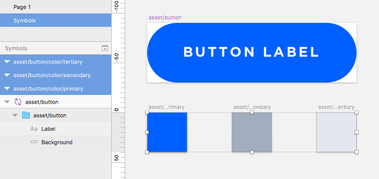
I will proceed to turn those into symbols as well, which will yield to a symbol menu that looks like this:

Nifty.
Great, now that we have those, let’s create artboards for the button states. I personally use this method, but you could also do these within the color artboards, but you’ll see why I decide to keep these separate. Also notice that I am using different artboard sizes for my states than I did for my colors, and this is simply because I deliberately want to make that distinction. More on that to follow… Finally, I name my artboards in the same manner, rather this time using asset/button/state/on, hover and disabled for example.
For the on state I draw a rectangle and just turn off the fill.
For the hover state I create a rectangle and fill it with black (#000000) at 20% alpha.
For the disabled state I fill the rectangle with white (#ffffff) at 60% alpha.

Now let’s convert all of those to symbols if you haven’t done so already.
Bringing It All Together
Now that we have everything that we need in place, let’s go back to the button symbol. We’ll select the Button Background from the layer list and group it. Open that group, select the background layer and make it a Mask by right-clicking it and selecting Mask from the contextual menu.
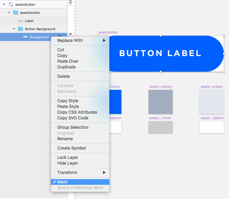
Once you have that mask, drop in your Primary color symbol by going to the Insert>Symbol menu and navigating to the sub-menu where you’ve placed your colors. Resize it to fit the entire area of your button.

Now do the same with your state (on in this case).

Let’s rename those layers real quick so we keep it tidy.

Putting Buttons to Work
Now that we’ve done that we have a single button that works for all of our needs. Let’s create an artboard and Insert>Symbol>asset>button.

Ooh, slow gif. Jif. Shush.
With that button selected, you can see the Overrides panel to the right has everything you might need to work with this button. Overriding the Label takes care of the button label, you can change between button types and assign a button state. All with the same symbol 🎉
Final Thoughts
If you need to create other button types or states, you just need to add another symbol into the mix. Notice that by keeping the arboard sizes slightly different for types and states meant that only those associated display on the Override drop downs. If you keep the same artboard sizes they will all display on both drop downs.

Them overrides tho.